Tuesday, March 26, 2013

Looking for the magic

As much as I don't like to admit it, it's been a real struggle the last three-to-four weeks to get motivated to work on my artwork. For various reasons, when the time avails itself to work, I haven't been able to do much of anything. When I get started on something, I find a ready excuse to stop shortly afterward.

"The studio is too cold ..." or "I'm not in the mood right now" or, my favorite one, "I have all day off tomorrow, I will do it then."

I sigh a lot.

It has created problems. For example, I had all the right intentions of making an excellent piece. I am working in colored pencil and, as I well know, it is a most unforgiving medium. When you don't have your heart in to your work, you produce something you really don't like.


There's certain aspects about every drawing you like and there certainly are a couple things about this painting that are acceptable. But for the most part, I didn't like what was happening. I think a lot of it was just not "getting in to it". 

This is the kind of art you do when there's no enthusiasm. The colors didn't feel right. The original drawing didn't feel right. It's just not good enough.

So I have about 3 weeks worth of work involved in this and at that point decided it's no good and we start over again.


Starting over on the same piece has never been
high on my "to do" list, but I also realized that the first piece was unacceptable.

I also know that this is a photograph, which I took last summer, that I truly want to do. When it comes down to it, that's really crucial to execution of artwork. Do you have enthusiasm for the project? To that question, I can answer "Yes!"

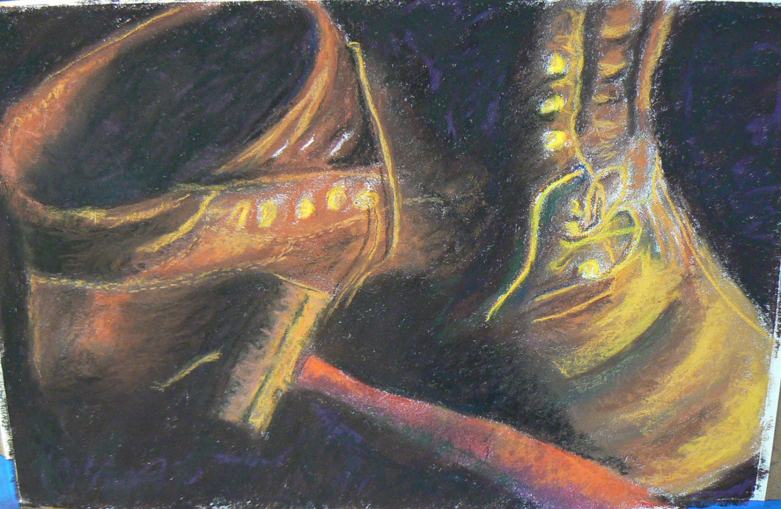
Back to the drawing board and you start over. The result is the photo on the right. What you see is about 9 hours of work and I am in a much more positive frame of mind about the direction of this piece. That doesn't mean I'm out of the woods. In fact, since I feel like I have to find the trail again anyway ... but I think I can see the path.

When you have this miserable feeling and you try to do artwork, you also start on a project and then jump to another and jump to another ... trying to find the spark again.

Hence, I have two oil paintings, that -- at their respective stages -- I actually think have promise. I need to look under a few brushes on the easel tray to see if I can find the magic again.

I like the clouds on this piece, a photo of a home facing the ocean in Kennebunkport, ME that a friend of mine took recently while on vacation. 

The photo didn't have as much light in the right places as I prefer, though a fellow artist friend loved the start and suggested the clouds had a "off screen" lighting as if the moon was in the upper left corner. I plan to "go with it"


On the way to Kennebunkport, my same friend stopped in New Hampshire and took a photo of a horse farm.

I liked that photograph as well and so far, this is where I am. I have a couple reservations about this piece, but I will keep them to myself and the gremlins in the back of my head till after the painting is finished.


I will have some more thoughts about this overall subject in the next installment of the blog.

CPSA Deadline Looms


For those of you who follow this blog and work in colored pencil, the deadline for the 21st Annual International Exhibition is fast approaching. In fact, final entries must be submitted by Sunday, March 31 at 11:59 p.m.


The link for entry information is: http://www.cpsa.org/

There's a thorough explanation on how to submit your entry through CaFE portal for contest entries. I'm not sure which paintings I plan to enter, but I definitely will submit two before the week's out. I have all day off tomorrow, I will do it then. Hmmm ....


Wednesday, February 6, 2013

Smolko Show Well Worth It

There are easily a half dozen or so colored pencil artists in the United States I admire and would hang their artwork in my home without a second thought. The top of that list for me, however, is John Smolko from northeast Ohio.

If you are unfamiliar with John's artwork, then I have included several of his paintings here on the blog. To see them in person, however, is the real treat. And you can have that opportunity as John is the featured artist in a one-man show at Wilmington College in Wilmington, OH. More than a dozen of his paintings are on display at the Harcum Art Gallery on the college campus through March 1. The gallery, which is inside the Boyd Cultural Arts Center, is open for viewing from 9 a.m. to 5 p.m. during the week.

That handsome fellow standing next to me is John Smolko at his art reception in Wilmington.
After I taught myself how to draw about 7+ years ago, the next area of concentration was colored pencil. Over the years, for all its pluses and minuses, I found myself moving away from the media mainly because colored pencils just inhale your time. The building up of layer after layer after layer was tedious and really wore me down. For the longest time I maintained that colored pencils artists could achieve significant results with just three or four colors instead of layering six or eight or 10 colors to get to the final one. In any other media, quite frankly, your really don't need to mix more than three colors to get where you want to go.

Then I discovered John Smolko. Immediately I was drawn to the impressionistic feel of his work. You could also see that he achieved dynamic results without the laborious process of building layer upon layer.
If you can see the painting behind John and me in the photograph here, you can see what I am talking about. But to give you further insight to that particular painting, I took a close-up photograph so that I could study the details of the stroke as well as the use of color. 


Close-up of John Smolko artwork
John's knowledge and use of color is truly amazing. And if you look closely, you can see that he accomplishes his goals with both his combination of stroke and his selection of color.  There are areas where there is simply one color over the top of a piece of colored museum board. 

 One of my favorite pieces is below:

Pardon the glare/reflection from the glass on the painting 


 And, again, I have provided another close up of the same painting.


In addition to the color selections that Smolko makes in his paintings is his unique technique of controlled scribbles. If you look closely you can see that all the marks, while appearing random, are actually where John wants them to be. He truly is a master of the "simple" scribble.

Finally, his most recent piece ...

As an artist we are constantly changing and evolving and it is particularly interesting to note how John's technique has grown more bold in recent years.

I had the great fortune of taking a workshop from John in Rising Sun last July and it completely changed my approach -- and attitude -- toward colored pencil. As you can tell from the painting that forms the basis of my logo at the top of the blog, I have embraced John's style completely.

All his pieces are the same size -- 40 x 32 and you will note that he draws approximately a 1-inch border around the painting itself. As John noted in his workshop, that border not only defines the location of your work, but it also provides a built-in "mat" for your work.

John is a signature member of the Colored Pencil Society of America (CPSA), and taught high school art in Aurora, Ohio for more than 25 years. If you have the opportunity to take a workshop from him, it would be a more than worth your time and investment! 

I have also included a link to John Smolko's website on my blog page so you can take a further look at many more of John's outstanding artwork.


Tuesday, January 29, 2013

WIP -- Part II


A week later than I had thought, though I noticed no one was beating my email doors down to get to the second part of the WIP on my Pastel painting.

Before we get in to the final part of the demo, I would like to point out that this painting is currently hanging through the end of March at Paxton's Bar & Grill in Loveland, OH. And, yes, it is for sale!

Getting back to the Pastel Demonstration. As I mentioned in the previous entry, it's really important to keep you hands and fingers as clean as possible. It really helps to have a damp towel and/or some hand wipes nearby. Beginning with Stage Seven, there is very little finger blending. In fact, I purposely avoid finger blending in order to allow the pastel sticks themselves to begin the blending process.

Stage Seven
 At this point, you begin moving away from NuPastels, which are harder, and begin moving toward your softer pastels.

The mid-range softness in pastels, for me at least, are the Rembrandt brand. You can generally find them in open stock as well as in half-stick sets. 

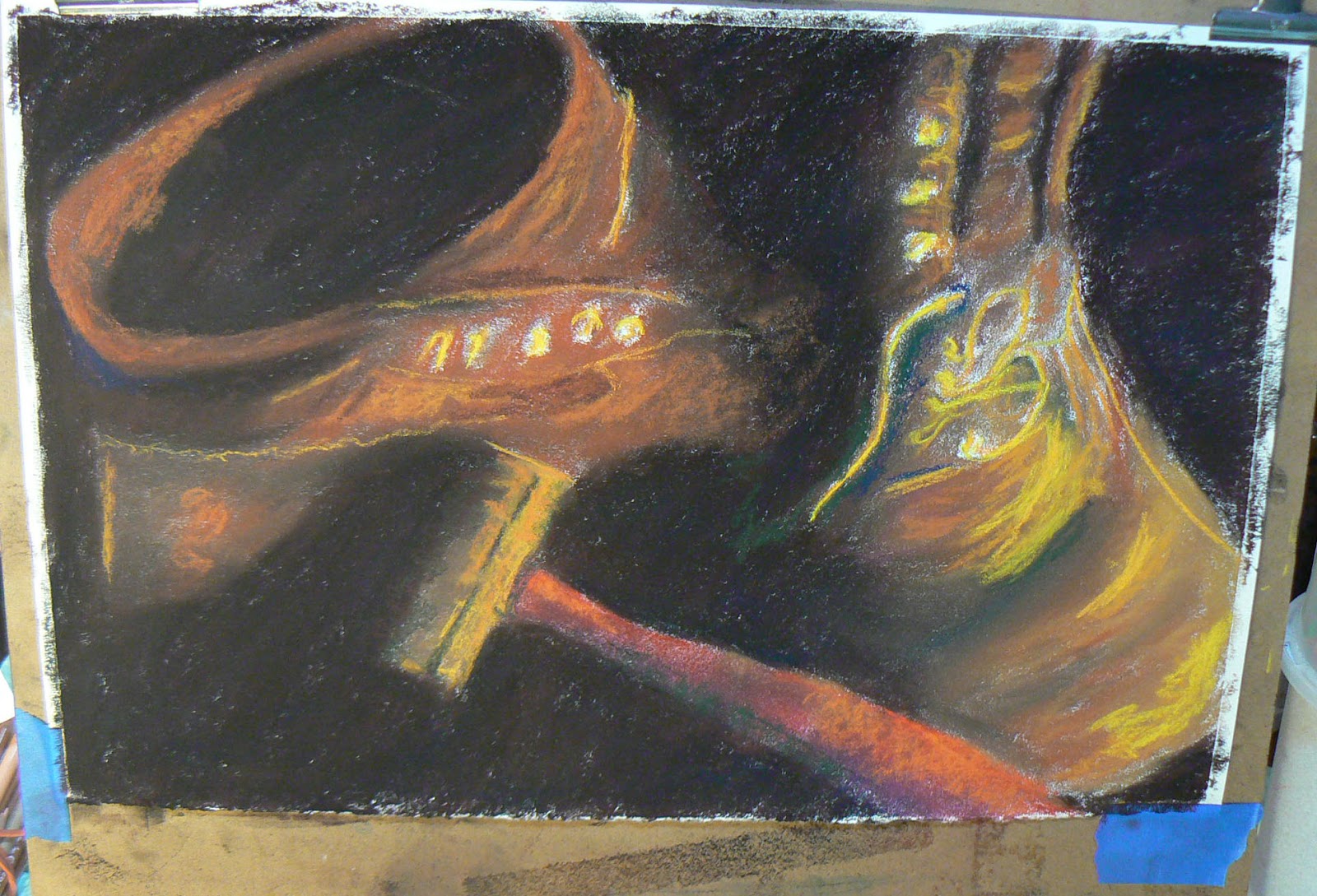
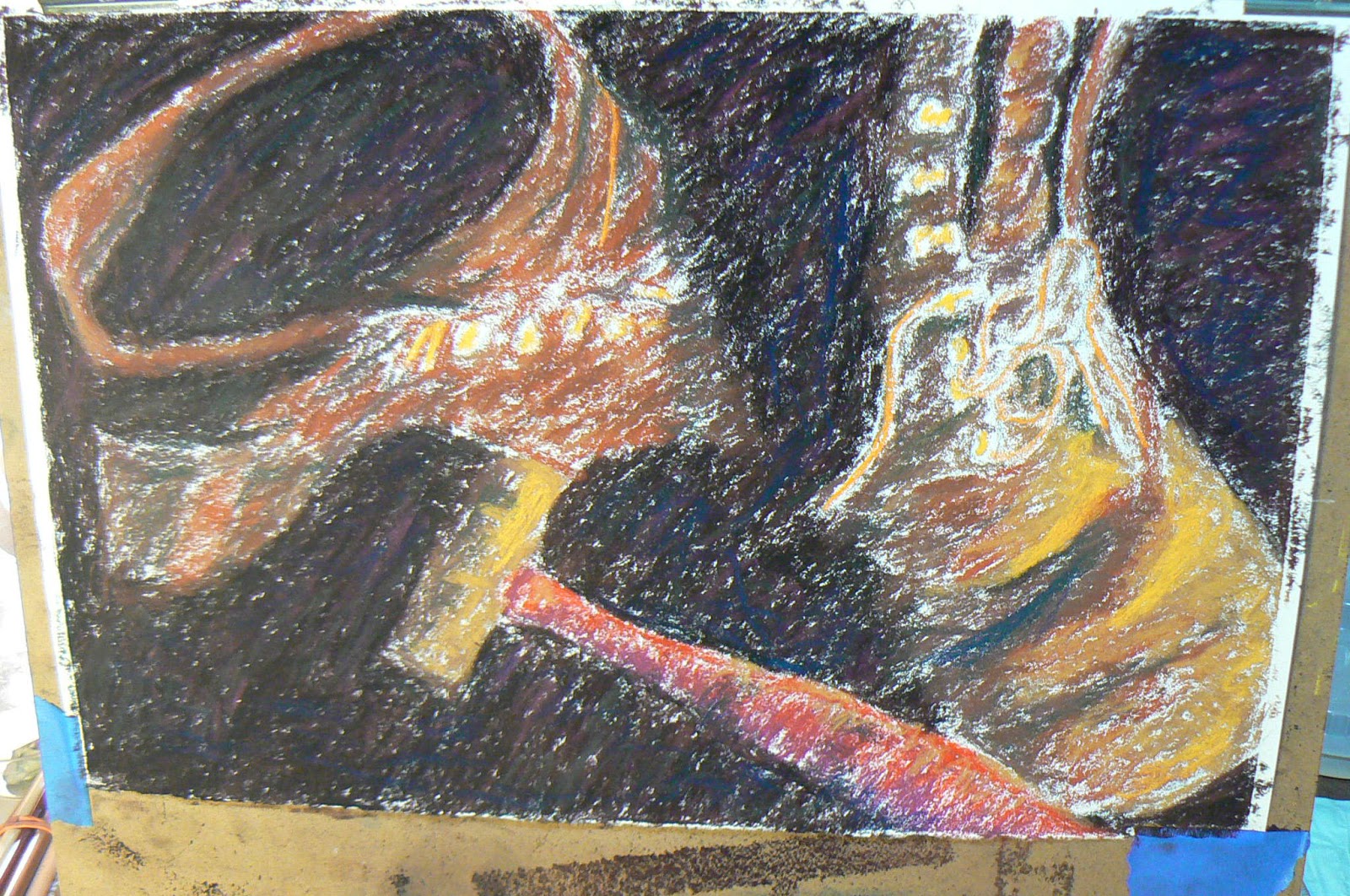
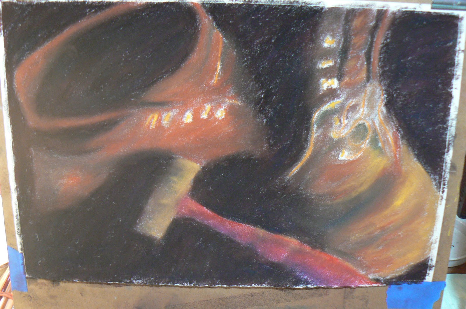
In Stage Seven, I began applying the Rembrandts -- yellows and oranges, and you might even detect there is some green in the shadow areas. I was hoping to give the shoes, and the background as well, a little more contrast or depth. I applied orange along the handle of the hammer and again, on the side of the left boot.
Stage Eight


Just as I said I try to avoid finger blending, I realized that I wasn't completely satisfied with the depth of the background, so I added some softer purple in various places. I knew when I added it that I was going to have to blend it. But that is part of the process of your work. You have to push and pull, add-subtract to get to where you want your work to go.

 You might also note that I have begun blending the reflection on the right shoe as well. That was done with the pastels. At this stage, I was moving back and forth between the Rembrandts, and the two softer brands that I prefer using -- Unison and Great American Pastels. 


Stage Nine

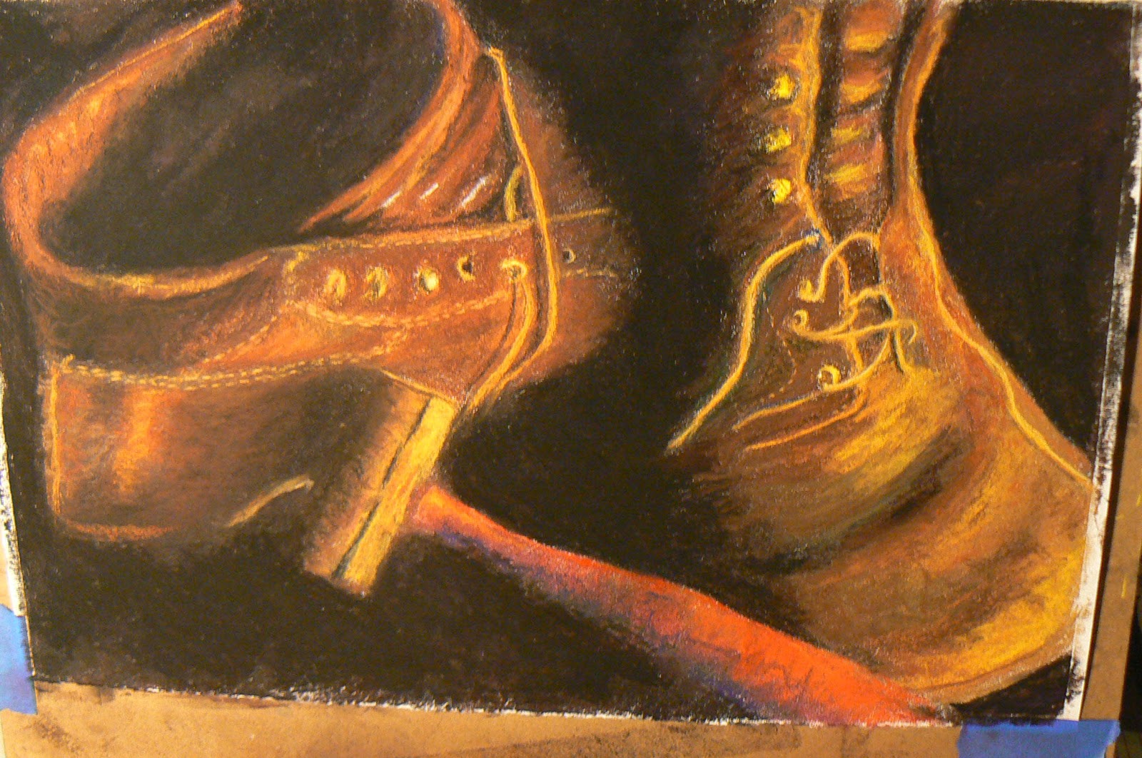
I toned down the colors. The previous layering was done intentionally to make sure the highlights were where I wanted them. I also knew that they were too harsh. The other thing that was bugging me was the way the shoe string draped the right boot. It made it too complicated originally. Keep it simple. So I eliminated part of the lacing. I also started work on more details, such as the eyelets.


Stage Ten

Again, more detail work with various sticks. On some of the finer detail work, I went back to the NuPastels because I could get a finer point on the end of the stick. I also sprayed the painting at this point with a fixative. I used Latour fixative by Sennalier.  I made a couple passes over the paper from about three feet away.

There are various schools of thought on using fixatives with pastel work. Many pastels artists do not like to use fixatives because they believe it has a negative impact on the vibrancy of the colors. In my case, I actually wanted to tone down the colors in addition to sealing the pastels to the surface. 

Stage Eleven

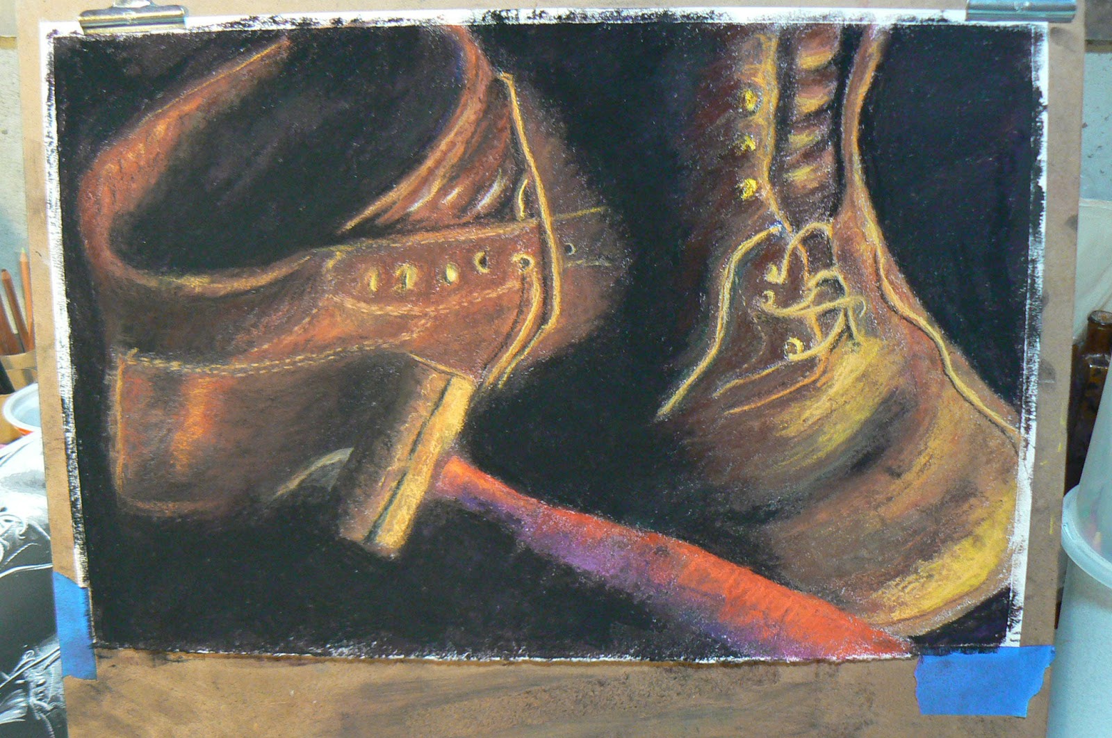
 Now I am really working more on details and fixing things that I feel needed work. I still wasn't completely satisfied with the crack in the head of the hammer. Nor did I feel the hammer showing the contour and shape of the handle. I also touched up the leather again to make sure it was dark where I wanted it (on the right shoe) and more glowing on the left shoe.


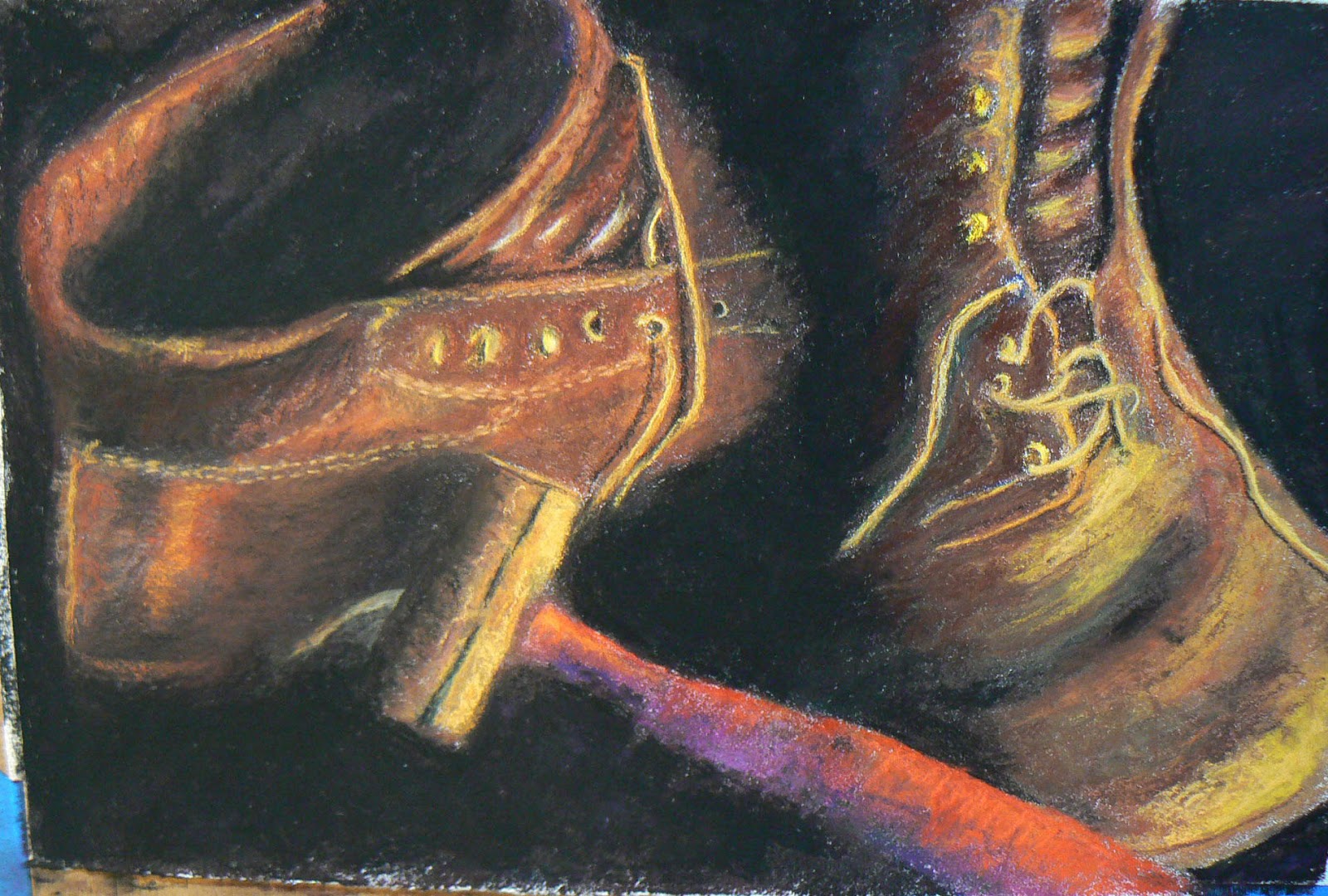
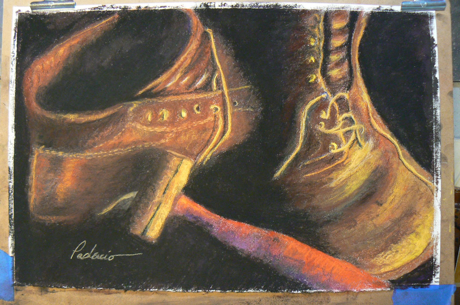
Fini!

 With the softest pastels I have, the Great American brand, I began tapping on the surface of the paper where I wanted highlights. Using the same pastels, I dragged them across the surface very lightly to add some last minute color.


When I was finally satisfied with the product, I applied my signature. 


The final step in the process is to get a sheet of glassine paper. It looks a lot like wax paper only without the heavy wax side. I placed the glassine paper over the top of the painting, then I got a soft-rubber brayer and, applying solid pressure, rolled the brayer over the top of the glassine paper. This pressure helps adhere the pastel to the surface and helps prevent on dust falling off the painting after you get it framed.

I know I should have taken a photograph of the painting in the frame. If the painting doesn't sell, then I will make sure I get that done and will post it on the blog.

When you are framing a pastel painting, you should always make sure you use spacers between the painting and the mat. The mat board itself should be reverse-beveled. You do both of those things to allow pastel dust to drop down behind the mat and not inside the glass atop the mat board. You don't want to see pastel dust collecting at the bottom of your framed artwork.

I certainly don't think this is the definitive process in pastel painting and I am far from an expert. The purpose of his demo-WIP was to show how I did this particular painting, what steps were involved and what I was thinking as the process was going along.

I certainly hope this is helpful to those who might be reading this and are wondering about working in pastels.  There are many excellent books on the subject. The book many acknowledge as "the Bible" on pastel painting, however, is The Pastel Book by Bill Creevy.

Hopefully, I will be able to maintain the promised weekly schedule on my art blog. Next week, I will feature one of my favorite colored pencil artists in John Smolko.

Till, then -- Keep Arting!


Tuesday, January 8, 2013

WIP = Work In Progress

I hope that everyone had a safe and happy time with their family and friends during the holidays!

The original plan was to get this blog up and running on a weekly basis after the first of the year. I started early mainly because I wanted to see if I could get it to work and look the way I wanted. So far so good. 

So on to the plan ... 

This week and next week I will feature what artists call WIP or Work In Progress. As an artist I find WIPs to be beneficial for a number of reasons. First, it's interesting to see how an artist approaches their subject. Second, I enjoy seeing how the piece of work goes from one stage to the next. Third, if there's explanation on how Step One moved on to Step Two, then it becomes educational. And, really, that's the most important thing for me as an artist. How did they do that? What were they thinking when they did that? Why did they do that then?


When I assembled the photos for this week's session, I realized I had 13 photos. Not sure if that many will be helpful at all or if it will be overkill. Based upon your reaction, I will use the same or less the next time I do this. (That's assuming, of course, anyone is actually reading this! LOL)

This WIP will be a pastel painting that i recently finished called "These Boots Are Made for Working." The setup includes a small tabletop desk easel and the surface taped at the bottom and clipped at the top to a piece of masonite board. On the table underneath the easel, I have a disposable underpad that can be purchased at medical supply stores or a pharmacy. On top of that, right beneath the easel, I have a metal tray, not unlike a cookie tray. I have that "lined" with a couple paper towels. The tray catches the pastel dust that falls down from the painting and it also is a handy spot to put my pastels on as I use them. That way I can keep track of what colors I'm using.

For the most part, I used Prismacolor NuPastel pastel sticks, Rembrandt pastel sticks, Unison Pastels and Great American Pastels -- which are, incidentally, made right here in Cincinnati.

So, on with the show ... 

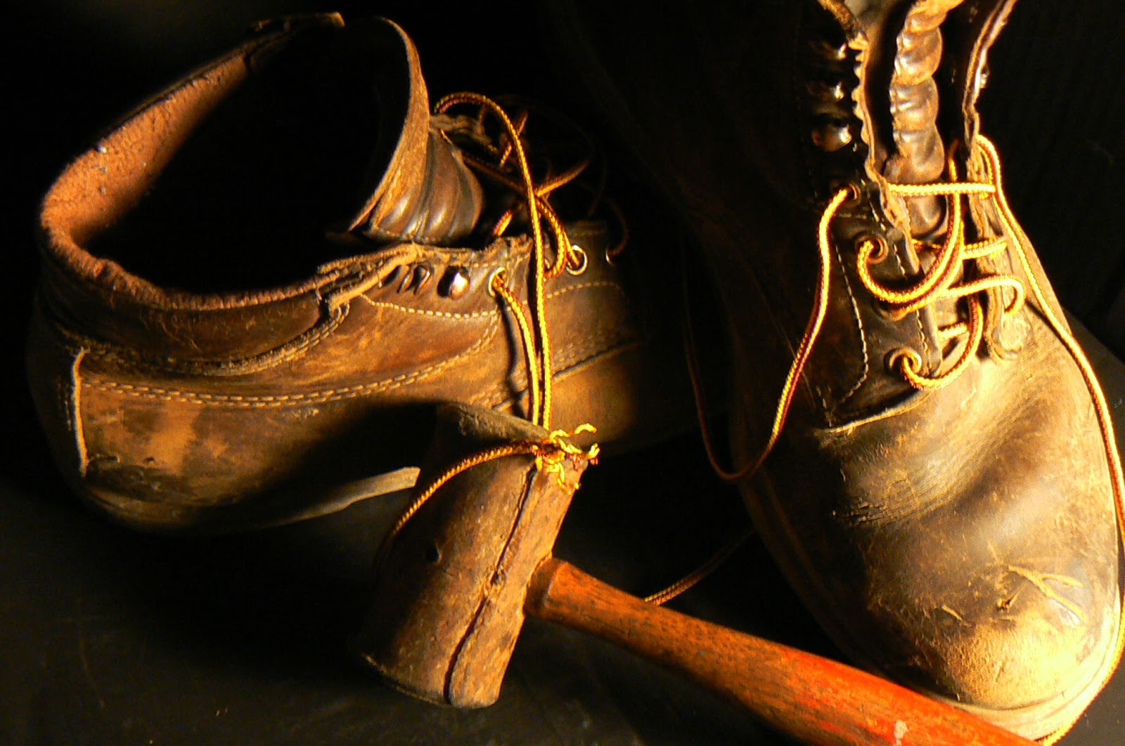
Original photo
The photo at the right is the original still life that I set up using a pair of old boots. The wooden hammer belonged to my father and somehow ended up my toolbox that I rarely use. The boots are made by Red Wing Shoes, a company based in Red Wing, MN that still manufactures many of their shoes in the United States.


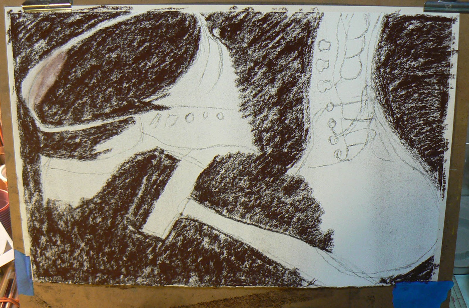
Step One
 I enjoyed the pastel technique that I learned this past November and wanted to continue to pursue it.  The "Still Life With Pear" that was featured in my previous Blog posting used the same technique. This time, I will explain as I go along. The surface -- a topic for a future blog -- was white Richeson sanded paper.

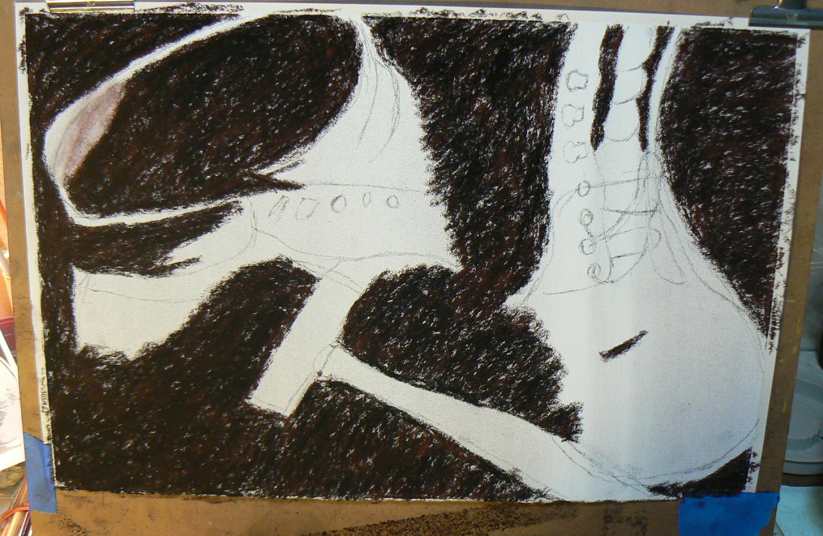
The first step was to rough sketch the original drawing with charcoal. I followed this up by painting in the dark areas with a Brown Umber Prismacolor pastel stick.

Step Two


Step two was to follow essentially the same path of the brown pastel, only this time I used a Black Prismacolor pastel stick. Why not use Black first? I believe the darker brown initially provides more depth to the black.
Step Three


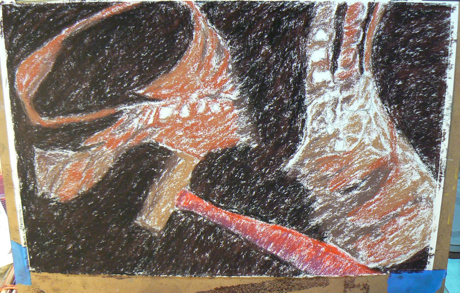
In Stage Three, I begin to introduce more color. Again, all I am using at this point are Prismacolor pastel sticks. Colors at this stage included Burnt Sienna, Sepia, Light Umber, Yellow Ochre, Red and a magenta-purple (Maroon or Plum) on the handle of the hammer. 


Step Four


More color is being added in Step Four, particularly with Yellow Ochre and an addition of Indian Red around the tongue of the boot on the right. As you can see, I've left colorless the areas where I intended to add the boot strings and the eyelets.


Stage Five


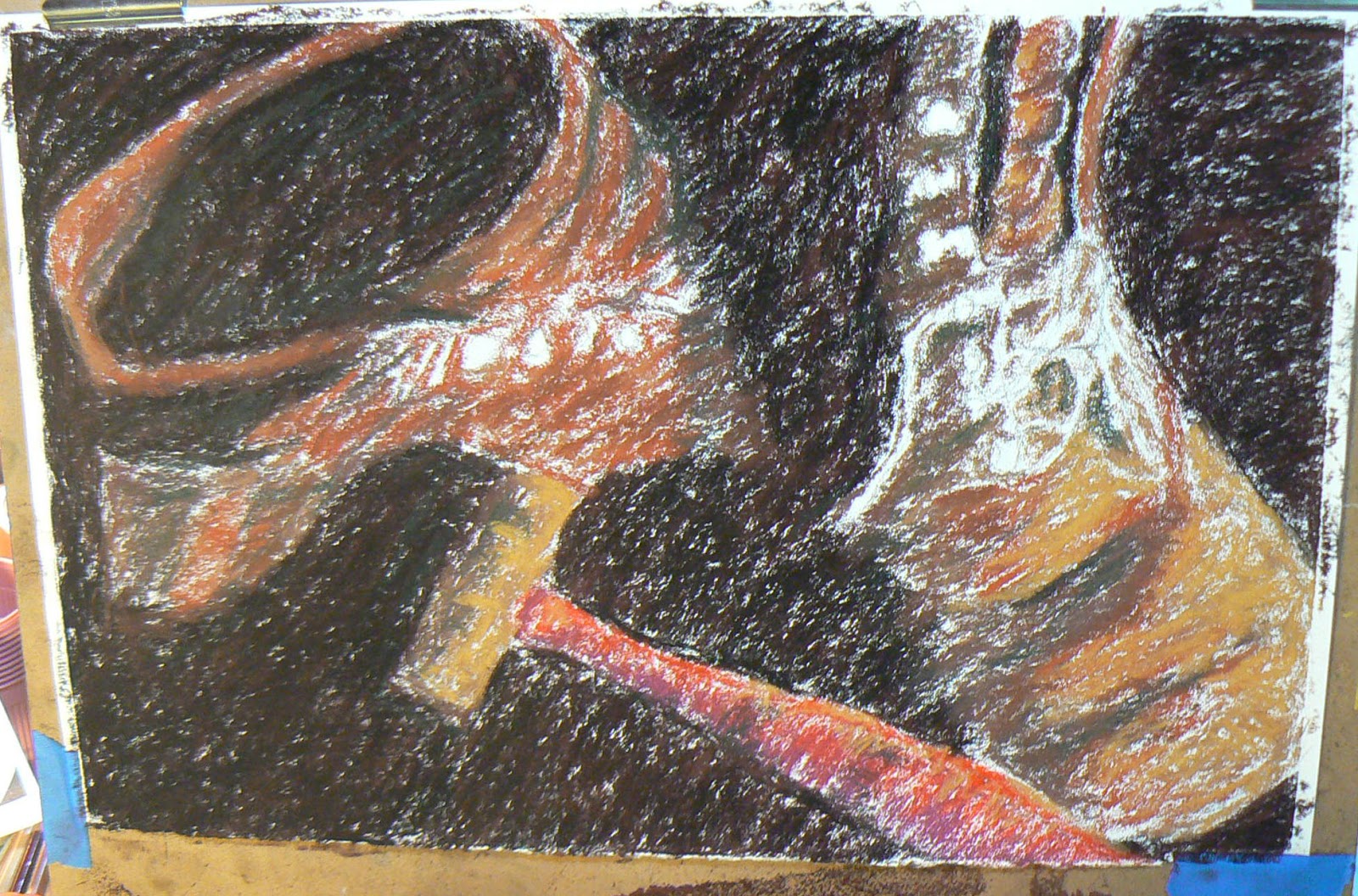
In this step, I've added Cadmium Yellow Deep in areas that I want to highlight. I've also introduced that same color to the eyelets. There are a couple streaks of Bottle Green in there too. I also added some Blue Violet in the backround to give the black more depth. I roughed in with Yellow Ochre a couple of the shoestrings, but I knew at this stage that where they are now is not necessarily where they will be at the end. Artists make adjustments. (Another future blog topic)

Stage Six
 
This is the fun part. Blending time. My favorite blending tools are my index fingers and my little fingers. I am indeed blending the entire painting as this point. This will be the only time that I will blend the entire painting. And, for the most part, there would be very little blending done with my fingers from here to the end. The rest of the blending that takes place is from the process of putting on more layers of pastel.


Blending, for me at least, is enjoyable. It's like being a kid again and finger painting. Only this time, you have a sanded surface under the layers of color. 

The vitally important thing you have to remember throughout all of this -- and especially during the finger blending stage -- is to keep your fingers as clean from pigment as possible. So you blend one area first (I started with the dark area and probably won't do that again), then wipe off your hands thoroughly and then blend another area (rinse and repeat) and so forth until you have the blended painting where you want it.

Next week we finish the WIP and show the final painting. 

Till then ... Keep Arting!


PS -- I have opened an Etsy Art Store! The link can be found on the Blog. You can also "Like" me on my new Facebook page at Mbpgrafix!

Tuesday, December 18, 2012

Good News and a Farewell


Should have done this last week when the news was more fresh, but since I am no longer on a deadline, I take advantage of those opportunities.

The Good News first. One of my two entries in the Loveland Winter Art Show, sponsored by the Loveland Arts Council, was named the Peoples Choice Award Winner. That's always a nice honor given those who viewed the art deemed it their favorite. It's nice to be loved. LOL

In any case, on the right is a photograph of yours truly standing next to the winning entry. The photo was shot by a good friend and fellow artist, Ed Aufdenkampe


Interestingly enough, Ed's file name was Still Life Michael B Paolercio. Still not sure whether he was referring to the painting or me. Hmmmmm .....


Both of my entries were pastel pieces that were inspired by an excellent workshop that I took in November in Rising Sun, IN. The instructor, Cindy Haase, made pastel painting a much easier process for me than it has been in the past. Very good teacher, I say. 

The last note that needs mention is the sweatshirt I am wearing in the photo. It is an image of one of the many paintings by my favorite artist, Frank Frazetta. More on him in a later blog, but I had to point out what I was wearing in case your curiosity got the better of you.

The farewell came later that same evening when, after four-plus years, I decided to close my studio at the Loveland Art Studios. A difficult decision for me because I truly enjoyed my time there. There are many outstanding artists there whose company I will miss. Still, support for the local artist hasn't been the best in this economy, yet the rent still comes due.

We started out with five artists back in September of 2008 and while many came and went in the studio, the final three of us -- Janie Yates (left), me (yes, I think I was still sober), and Marcia Greenwald (right, who was there from the beginning) -- are pictured below.


Where I go from here is still up in the air. Stay tuned and I will provide that update when I know it. Hopefully, more promptly than this post.

The Greater Cincinnati Chapter of the Colored Pencil Society held its annual art show the day before the Loveland Winter Art Show. There were more than 100 entries and the quality of the work was stunning. The First Place winner (right) was by Margi Hopkins. The shadow across the top of the image was from the lighting at the show and from my not-so-nifty camerawork, not on the artwork. My mere words can't truly describe how wonderful Margi's piece is.


While I entered three pieces in the show, my personal favorite was Putting on the Ritz, which I featured in the previous entry. However, this time, Eldon is the real star being held by my son-in-law, Dr. Michael Heile. Eldon is his brother's son.


That's it for now. Merry Christmas to everyone and a Happy and Safe New Year!!!

Tuesday, December 4, 2012

The Plan


The plan is to get this blog spot up and running some time after the first of the year -- barring any complications from the Mayans.

In the meantime, those of you who may be in the Greater Cincinnati Area might be interested in attending the District Chapter DC #119 Colored Pencil Society Annual art show on Friday night at The Barn in Mariemont, beginning at 6 p.m. It's located at 6980 Cambridge Avenue, tucked away in a little subdivision. Now the home of the Women's Art Club, it used to be the village's fire station. In fact, there was still one of the horse-drawn fire "trucks" on display in one of the barn's garage areas.

This show will feature more than 100 paintings. There are four signature artists in the CPSA chapter, including CPSA founder, Vera Curnow, Cecile Baird, Jean Malicoat and Sandy Vaughn.


One of the three pieces that I have entered in the show is below, Putting on the Ritz. The subject is my daughter's future husband's nephew (say that five times real fast) getting fitted for his tux for the upcoming wedding. Oh, by the way, I will never draw another person wearing a striped shirt again ...


One parting note ... the painting at the top of this blog, Dizzy, is currently on display (and for sale) at Paxton's Bar & Grille in downtown Loveland, OH

Now ... to figure out how to arrange this layout to look better ... hmmmm