Tuesday, December 2, 2014

Art Shows this weekend

The Irregular Blogger Returns! At least irregularly ...

I've been painting quite a bit lately -- and, sad to say, neglecting my drawing skills regimen. I have been excited, however, about how I am progressing. While I've done about 6-10 paintings since I've last posted, the two that have been most satisfying while be featured this weekend at two different Winter Art Shows.
 
Winter at the Horse Farm in New Hampshire will be at the Loveland Artist Studios on Main for Friday, Dec. 5 artists reception from 6-9 p.m. I have won People's Choice Award two years in a row at the Loveland Winter Art Show. Food, wine, music and merriment! Click the link for directions, though the easiest way to find the studios is to located the Loveland Post Office and the studios are across the street in the old school house.

Winter at the Horse Farm in New Hampshire  is a 24 x 30 oil painting. I've been working on it off and on most of the summer and fall, but really pulled it all together over the last 4-6 weeks. It sounds as if I put more time in to this than it really was. In actuality, less than half the time I would take on a normal-sized colored pencil piece.

Winter at the Horse Farm in New Hampshiire
The Three Brothers
On Saturday, The Three Brothers will be at the Essex Art Studios on Essex Place for the annual Friday-Saturday Winter Art Show that runs from 6-10 p.m. I will be at the Saturday show in or around studio #124. Both nights shows run from 6-10 p.m.

The Three Brothers is my first excursion in to the world of fantasy artwork. I loved doing this. The white dragon was more difficult to do than I ever anticipated. I still am not sure I completely like it, but you reach a point where you need to stop noodling and accept it. For the time being ...

The third dragon, by the way, is the gold dragon, up near the peak of the distant mountain.

The painting is 24 x 30 and done in acrylic painting. Easier clean up. Oil is more fun cause you can BLEND so much more easily. Getting transitions accomplished in acrylic is challenging and I find myself constantly re-doing it. I am not sure, however, i could get the detail on the red dragon as well in oil paint. Especially since I have a tendency to rest my hand on the canvas. (Yes, I am aware of maul sticks. I find them cumbersome. More learning must be done).

Facebook 

One of the reasons I haven't been posting as much on the blog is that I have been posting more often on my Facebook page. Most of you who might read this blog (and the throngs are overwhelming, I know), are already "Friends" on Facebook. If you are not and want to stay up with my art musings and such, feel free to send me a "Friend" and I will be more than happy to respond in kind!


Hopefully, I will see you at one of the two shows this weekend! Hope your Thanksgiving Holidays were fun and eventful and happy!!!!
 

Sunday, August 17, 2014

Masonflowers

My guess is every community in the United States and probably around the world has a patch of sunflowers that draws folks every year.

There's one here in the Mason area on the corner of Snider and Irwin-Simpson, across from Cottell Park. My guess also is that every artist in the United State has wanted to or has drawn or painted a sunflower. This is my contribution. It may not be my last sunflower, but it is my first! 

Masonflowers (Acyrlic 15 x 30)
It's not completely finished yet, but it's pretty darn close.The painting was done in acrylic on a 15 x 30 gallery wrap frame.


I will have it hanging this coming Thursday (August 21) at the Artists Lounge gallery in the Pop Revolution Gallery on 105 East Main Street in Mason.

Third Thursday runs from 5-to-9 p.m. at the gallery and will feature drinks and snacks and music and a door prize!

The painting will also be available as an inexpensive print via Imagekind.com (Searchword: mbpgrafix) some time this coming week as well.

Hopefully you can be part of Thursday's fesitivities!!


Wednesday, August 6, 2014

Fantasy time

(Can't believe it's been almost two months since I have posted a blog!)

Growing up with asthma, I spent a lot of my youth indoors wishing I could be outside doing things. I ended up reading a lot -- Edgar Rice Burroughs and Robert E. Howard, chief among them. A lot of comic books and a lot of doodling and a lot of wishing for this and that. Some folks probably call it fantasizing. There were a lot of artists who I thought were just the best (that varied from one week to the next, of course) -- Gil Kane (The Atom), Jack Kirby (Fantastic Four), Steve Ditko (Spider-Man), Al Williamson, Wally Wood, Jim Steranko and Neal Adams.


Frank Frazetta's Tarzan
None, however, could replace my all time favorite artist, Frank Frazetta, who I have written about before. I can't tell you how many times I sketched, traced, drew the drawing here by Frazetta as part of his series of drawings of Tarzan.

I think the very process of doing that helped me in several areas that I never realized until I started actually pursing artwork about eight years ago.

First of all, drawing in black and white, I developed a strong sense of values. The darkest darks, the whitest whites and the various shades in between. I remember when I first took a drawing class in Hamilton, my first instructor -- Allison Shepherd -- remarked how well I had a sense of value and contrast. Who would have known? It really is about the drama of the light source. The light establishes your darks.

Second, to this day, I still have a fairly decent sense of anatomy and muscle structure. Foreshortening is another story altogether, but where muscles attach and how they work with and against each other is something I've manage to understand pretty well too. I wish I had drawn the hands and feet more, though!

Third, I learned a sense of drama or story-telling that is important in artwork. Can one painting carry a story? For me, that's the sign of a great artist. That may not be the textbook definition of artwork, it may not fly in the museum or gallery community, but it works for me. It's something I strive to do in most of my paintings.

Finally, the most important lesson, was the fantasy. The escape. The place to weave dreams and replace reality with something else. It's the kind of painting I've always wanted to do. 

Once I started taking up artwork seriously, however, I came to the realization that fantasy artwork -- while probably the least respected or regarded -- may also be the most difficult. As an artist you need to master ALL the genres -- portrait art, anatomy drawing, landscape (afterall, you need a dramatic setting), still life and motion.  Furthermore, you can't do a plein air painting of a dragon in flight, and there are no photos you can take of elves and hobbits and ogres. I was nowhere close to doing this kind of artwork when I first started.

I think I'm getting close now. And, what excites me most of all, is that I am doing it in painting, instead of drawing. Both of the paintings are NOT finished.


The Defender of the Realm (oil)
The painting on the right, I'm calling it The Defender of the Realm. This was done in oil and I am really glad that I started it in oil because painting the dramatic clouds in the background are so much easier to do in oil paint. (Thank you, Todd Price for teaching me this!)

Much of the front leg and some of the armor will still need to be worked. The shadows under the right arm, along the cape, need to be darkened. The sword still needs to be fine-tuned. All in all, for the first one, I'm pretty happy.


I have five different books of Frank Frazetta artwork but, interestingly enough, he never painted a dragon. He's painted all kinds of monsters and demons and winged creatures, but never have I come across a hard-core dragon painting. 

The Three Brothers (acrylic)


Dragons have always fascinated me. Magestic creatures. That's my word. Majestic and magical combined -- Magestic.

This piece, painted in acrylic, still has a long way to go, but most of the right third of the painting is set. I needed to get the Red Dragon fully realized to get the perspective of the other two dragons. The middle dragon -- the White Dragon -- needs to be tweaked. The far dragon -- the Gold Dragon -- is well placed, though a suggestion from my Monday night guru, Ken Buck, helped in tilting it more.

The mountains (again, lessons learned from Todd Price) in the background will need further detailing. I need to get some separation from the front mountainside from the mountains behind it. Some different lighting will achieve that result. 

The bluish blob in the lower left is actually going to be another mountain/hillside, but there will be several towering trees that will lend perspective to the landscape. Just how far away are those mountains? How big is the White Dragon if those trees are that big?

I'm having fun. Starting to paint Fantasy Art. Something I've always wanted to do. The time has come.

324 Revisited

324 (Colored Pencil)
I had the great fortune to have my colored-pencil painting, 324, selected for the prestigious Viewpoint show. The 46th Annual national show, sponsored by the Cincinnati Art Club, is also one of the most difficult shows to get juried in to each year. I am very honored.

I am, however, drawn back to being upset with the fact that this piece -- which has now been entered in five different shows (three juried shows) -- and has won awards in three of them -- wasn't deemed good enough to get in to this year's Colored Pencil Society of America show.

You have to wonder what the CPSA judge saw -- or didn't see -- that seven other judges (five of whom are well-regarded artists in their own right) thought was worthy of inclusion. I know it smacks of sour grapes, but my logic says otherwise.

Wednesday, June 18, 2014

Demo Artist armed with a paint brush

Doesn't seem like it's been a month since I've posted anything. I actually started two other pieces, but have decided against publishing them for the time being. Instead, I'm going to do some "catching up." 

Last Thursday (June 12), I was the demo artist at the Artists Lounge in the Pop Revolution Gallery in Mason as part of our monthly Open Studio reception. Not having done something like this before, I wasn't sure what to expect. Unlike the previous blog in which I was actually teaching a short pastel workshop, this was an exhibition for people to watch me work and ask questions during and about the process.

Me, allegedly hard at work
I decided to do the demonstration in colored pencil, in the technique that I employed in my self-portrait, The Irony of Me. Some of the guests and all of the artists had seen that painting in the "Self" show.

I loaded up most of my pencils, reference photo, erasers and gadgets, as well as one of the two electric pencil sharpeners that actually work. I had done some preliminary work so as not to spend half the evening transferring the image on to the illustration board. After setting up on a card table, I was pretty much ready to go.

This was different than the workshop in many ways. For one, I wasn't explaining as I went along. It was, for the most part, as if I was working in my studio at home with people wandering in and out. I think that created some anxiety within me because I could see as the night, and the project, was going along that I was doing some things that I wouldn't have done if I had been working alone in the studio. I felt as if I was rushing myself instead of just taking the time and "letting it happen" as it usually does at home. I think another factor that came in to play was working at a place that wasn't my drawing table. I had to keep looking for where I placed things instead of knowing where they were instinctively.

The nice thing about the night, though, was that there were a good number of people coming through the gallery. Interestingly, however, most of the questions I got were from fellow artists or artists who had come to view the Open Studio event.

All in all, it was a great experience and, if I should ever do this again, I will be better armed -- mentally for sure. The painting, itself, won't get finished. Along with strokes and colors in the wrong place, it was good to learn that the size of the image was not big enough for work on the 16 x 20 board that I seem to prefer using lately. I plan to revisit this project in the near future.

I want to thank my good friend, Ben Effler, and fellow artist and photographer, John Weller, for taking photos of me at work last week so I could post them on the blog. As it turned out, I felt this was the best one!

Painting, painting and more painting

Despite the fact that my demo was in colored pencil, I have had some difficulty with my colored pencil work this year. Given the fact that last year I spent seven months working on two pieces, I haven't been able to get myself motivated to overcome that daunting amount of time required to do quality work.

The Elk at Glacier National Park

Instead, I have been painting more and enjoying it more, too. It truly helps taking classes on Monday nights at the Essex Studios with Ken Buck, who I believe is one of the finest teachers in Cincinnati. And another great benefit has been the one-on-one work with my good friend, Todd Price, once a week.

I can't even begin to touch upon all I have learned in oil painting from Todd, who I believe is one of the top 25 historical landscape artists in the United States.
The River in the Valley

The two paintings I have here, The Elk at Glacier National Park and The River in the Valley, were done over the course of the last three months. That seems like a long time, but in actuality, I painted with Todd once a week for anywhere between two-to-four hours. Both canvas are 12 x 16.

I employed Todd's palette colors, which in itself, is limited to about eight colors. He doesn't have one lick of green paint on his tray at the start of the night. All his greens are of his own making. In addition to being a marvelous artist and a great teacher and friend, Todd could probably teach history at any college in Greater Cincinnati. For his paintings to work and sell, he has to know what he's painting. His research is -- down to the buttons on the uniforms of the Civil War soldiers to the gas mask he found for his World War I painting -- is unparalled.

I have a greater sense of satisfaction seeing the finished product of my oil painting than I do with colored pencil. There's a feeling of "majesty" (for lack of a better word) to it.

That's not to say that every thing I've painted has gone well. I have been struggling with the painting I have been working on with Ken on Monday nights. We have done extensive revisions to it. Part of the problem has been the water-soluble oil paints, which just don't work as well as regular oil paints.

The Dreamweaver WIP1
The other part of the problem I am having is that I knew the image I wanted to paint. I just didn't have it as well-defined as I originally thought. I had roughed out several sketches and while those looked good on paper and in my mind, it just wasn't translating on canvas.

We have made at least three changes to the painting, eliminating chairs, eliminating the pantry, and -- most importantly -- defining the light source and its impact on the surroundings in the painting. The light on the tables in the second image demonstrates where I want to go with this eventually. One of the next steps is to start manipulating the shadows.
The Dreamweaver WIP2


I think I am now at a point where I have a much better sense of where I need to take this painting. On the other hand, I'm not sure this is going to work as it is and may have to start all over. If I do that, at least I have much more confidence in where I am going with this.

I also feel a whole lot better now that I have a title -- The Dreamweaver. (This is another piece in my Romance series.) Usually, I have a title for a painting in mind before I even start a painting. For me, it helps me to define or focus. 

There's much more work on this ahead. Not sure it will ever be as good on canvas as it is in my head, but that's what every artist struggles with every time they start the day!

Finally ... I actually have a couple more paintings I was planning to show here, but this blog has already gone on far too long. Maybe next time ...

Thursday, May 15, 2014

Teaching a workshop

Teaching is something I've always entertained as a possibility during various points in my life. My patience level has never been the best, however, and it's a quality among those of the teaching profession that I have always admired. I clearly couldn't have taught elementary school. Third graders, I suspect, would have trouble getting their little mitts around my sense of humor.

When I was approached last fall by fellow colored pencil artist, Autumn Huron, to teach a pastel workshop in May, I admit I was a bit wary. But the more I thought about it, the more I thought I would give it a shot. Afterall, the Colerain Artists Guild would not include third-graders.

The first thing I do whenever I have to make any presentation is "The Five P's." Prior Preparation Prevents Poor Performance.

I outlined a plan (just like a real teacher), and assembled my supplies accordingly. I decided to start with basics. Making assumptions that all artists have done a media was the incorrect approach.


Colorfix
Perhaps moreso than with any other media, the basics in pastel surrounds the support of the artwork. With watercolor painters, for example, you start with Arches watercolor paper and end there. Anything else, really, is a waste of time.

Pastels are the other extreme. You can work on a lot of different surfaces. I prepared the four most common on Masonite board so I could pass them around to the members attending the workshop.

The most commonly seen, and perhaps used, surface is the Canson Mi-Tientes paper. It has a slight texture and is good for pastel, but I found, as I mentioned in the presentation that it really doesn't have much tooth. It doesn't take many layers and after a point, the pastel won't cooperate.
Canson Mi-Tientes


The next textured paper I have used is the Colorfix Sanded paper. It is an excellent product and it will take a lot of abuse and layering. It's also pretty pricey.

The third I passed around was Velour which I have also used on a couple of pastel paintings and I really like its texture. It doesn't hold pastel very well, however, but its positive is that it is so darned soft and willing to help you as an artist as much as it can.
Velour

The final product is what I use most often and that's Richeson Sanded Paper. The texture is a more gritty than the Colorfix and, for my style of pastel painting, it suits me best. 

The next part of the presentation was noting the difference between oil pastel and "soft"/chalk pastel. Within the pastel family there's at least three steps or grades to use. The first is Nupastel, a stick produced by Sanford (Prismacolor) and it's hard. Great for putting down the first layer and perhaps at the end for fine detail work

The second is the Rembrandt level pastel which really carries the load. This "medium" level makes up about 75-85% of your painting. The third level is your softest brands and there is a large variety to choose from. My favorites bounce between Unison, Terry Ludwigs and Great American (made in Cincinnati!). Sennelier makes a soft brand as well, but it is not one of my favorites.


Work space with Velour "Mr. Lou" in background
With my table all set up and ready to go, I began working on the painting based upon the photo that I brought with me. Simple photo -- two apples and a banana. Having attended a number of workshops myself, I tried to follow what has been helpful to me -- having the instructor talk about what he or she is doing WHILE they are doing it. 

I admit that I was more nervous than I thought I would be. Artists are always told that they never do their best work in a workshop. Well, I wonder if teachers think the same thing! My painting worked satisfactorily, but it wasn't as good as when I have done this same piece in my studio. 


Yours truly starting painting
The sort of finished product


I easily went longer than the 30 minutes Autumn had originally suggested, but I hoped that when all was said and done that the ladies in attendance learned even a little something. I had a good time. And the "teacher" learned a few things too. For one, it's okay to breathe. It helps alleviate the jitters!

Painting and more painting

The more I am painting, the more I realize how much I enjoy doing it. I work once a week painting with water soluble oil paints with instructor Ken Buck at the Essex Studios, and once a week in oil paints with my good friend, Todd Price. I am actually -- finally -- gaining more confidence with the brush. It's such a great feeling to know that you can actually fix a mistake! That colored pencil anxiety just isn't there. It's only paint! (My new mantra). If you don't like it, paint over it and start over, rearrange, add, subtract and -- all on the same surface!!!! I don't have to throw my Stonehenge colored pencil drawing out after 6 weeks and start over again! So cool!
WIP: Water soluble oil/Part of Romance Series


My other big concern when I first starting painting was "So I mix these paints and get this cool color ... how do I do it again the next day." Two key things that Todd Price has taught me -- limited palette and his weekly reminder -- "You mixed it once, you can mix it again." And you can. Especially with that limited palette.

And, like anything else, the more you do something, the more comfortable you feel. The more you mix Prussian Blue and Van Dyke Brown and a hint of Indian Red or Magenta -- you get Black! It works every time. I impress even myself.

There is, as I have noted in previous blogs, a decided difference between oil paint and water soluble oil paint. Regular oil paint is the way to go for me. At least right now. I keep working the water soluble though in hopes I find the right mojo.

Where have I been?

It has been quite a while since I've posted anything whatsoever. I have to admit I'm still chapped from not getting accepted in to the CPSA International Show this year. I've actually written three blogs addressing that issue, but as much as it is against my inherent nature, I am trying to tone down my comments. So the first three attempts remain unpublished in "draft" mode. The next blog or so will probably include my observations and criticisms. Part of me says to publish my first rant -- I'm not sure if anyone reads my blog anyway. I keep thinking time will assuage my feelings. Nah ... not really.

Tuesday, April 15, 2014

Loose ends

Never enough time to do all that I want. I suppose that's good in a way as I am never looking for an idea hiding under some Illustration Board.

So this blog edition will be a hodge-podge of what I've been doing, what I am doing and where I might be going. And probably too long-winded ...

What I've been doing ... I am nearing the conclusion of Flowers for Katie. One of these days I will learn to shoot my artwork correctly (that line at the bottom -- where the flower pot is resting -- is really straight!).

Flowers for Katie (oil painting)
Hopefully there never comes a time in my arting journey that I haven't learned something or two or three ... 

There's a couple of insights that this painting has provided. First and foremost is that this is the first larger scale painting I've "finished" using water-soluble oils. That, in itself, was an experience. The positive so far has been that the paint blends so much more easily, at least for me, than acrylic paints. The clean-up is fast. Just soap and water and you're good to go. The negative has been that it does seem to take a long time for the paint to dry. Much longer than oil paint. There almost seems to be a "tacky" feeling to the paint and I'm not sure what is causing that. Any insight would be appreciated!
Close-up of door


The second thing I discovered near the conclusion of this work was trying to make the door recede a bit. At one point in the previous blog you might notice the door seemed flush with the wall/frame. There was one simple little thing that I did that made it work ... and it really looks better in person than in this image. 

I simply added some lighter streaks of paint along the edges. The lighter paint against the dark streak pushed the dark end of the doorway further back.  .... Still a few things need to be done to this before I'm as satisfied as any artist can be with their work. I want to work the daffodil in the upper right a bit more, punch in a few more lights. Tweak the little yellow flowers in the front of the flowers. Make the lower right petal on the middle daffodil slight larger, so it forces the blue rose out in front more (sort of a reverse on the door edge). The panel insets on the door still bug me a bit and that needs a tweak or two.

Roger (oil painting)
Finished up another of the smaller water-soluable oil bird paintings. This one is varnished. An egret. For lack of a better title, it's being called Roger.


Oil Landscape (Untitled)
Then there's my Wednesday night painting sessions with my good friend, Todd Price. He has helped me immensely with my oil painting (oil oil, not water-oil ... hehe)

The painting on the right is about 16 x 20 or so. The top image is actually the reference photo. My painting is below it. I am guessing it will likely take another two or three weeks before it's done. But I'm liking how it is coming along. I have picked up a few techniques in how to put in the mountains and paint rocks, as well as painting trees.

You might noticed the brownish strip along the bottom of my painting. That will provide the shadow for the grasses that are to go in this week. If you look closely at the bottom of the ref photo, you can see the straw-colored grass. There will likely be an elk or deer put in this scene as well to lend more perspective to the entire piece.

I can see myself moving more and more in the direction of oil painting. The blending and just the vibrancy of color really can't be reproduced in any other medium I have tried thus far.

Colored Pencil and ... Who knows what?

The annual CPSA DC Chapter #119 annual show is coming up in September and I have to begin work on what I hope will be two pieces that I hope I can find time to finish. The one below is in the very very infant stages. It's an corrugated metal shed with old tools that are hanging on a dried out wood board. 

Old Tools Shed (Colored Pencil)
This image is based upon a photograph I took while I was in San Antonio last fall. The light at the time of day when I took this photo was outstanding. There will be a lot of rust and a lot of shadow and ... sigh ... a lot more work to go. 

It's a lot more detailed and intricate than the image shows.The chains are convoluted and they cast shadows on the corrugated metal wall. Never let it be said I settle for the simple things.


Finally, I have been playing around with the "mixed media" notion that I first did in a workshop in Rising Sun that I took a couple years ago. In that workshop, I was using newspapers and rice paper and paint and this and that and who knows what because I can't remember what all went in to the final product.  I remember the weekend well, however.

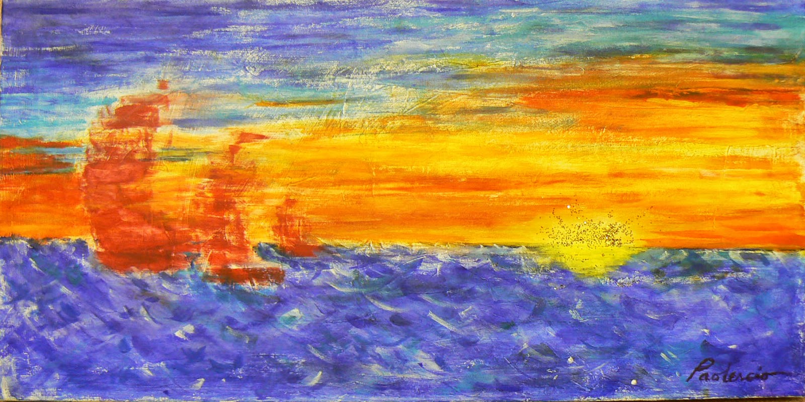
Red Sails in the Sunset (acrylic/glitter)

In any case, I finally decided to work with a color component -- glitter. I am not sure how it is going to work, if it will work at all, but I won't know if I don't try. I have done some experimental paintings with what I'm tentatively calling the "glitter technique" and, surprisingly, it met with a positive response from a few of my artist friends.


One of the drawbacks to the "glitter technique" is that is really doesn't translate on an image/screen. It was and is my idea to use the glitter not as a crutch or a gimmick, but actually incorporate it in to the artwork itself. Thus, a little glitter goes a long way. Will it work? I really don't know. I know I will have to spray-varnish Red Sails so that the glitter doesn't fall off. I will get it framed, but I'm not sure whether I need to put the painting under glass now or not. Lot of questions still need answers.

If you have made it this far ... I leave you with a outstanding quote from a dear friend and fellow artist, Paul Sensbach, "Life is too short. Go for the dessert first."


Monday, March 24, 2014

It's Spring!

A walk outside here in balmy southwestern Ohio may beg to differ with my post's title -- and it's supposed to "snow shower" on Tuesday -- but, oh well .... IT'S SPRING! (If I say it often enough, it will happen.)

With spring in the air, it's time for sunshine and robins and all those good signs of the season.

It's Spring (Acrylic painting)

The painting to the right -- It's Spring -- is something in the area of design and color I like to explore. Every color used in the painting is solo, no mixing of colors. I did that on purpose.
 
Whenever i look at my paintings and the photo I have taken, I wonder if they could possibly be the same thing. 

The sky is actually quite blue -- Brilliant Blue, in fact, according to the tube of Liquitex acrylic paint. The ground is green, but it is straight! Somehow it looks like it's an upward slant from left-to-right, but -- really -- it's straight. All the outlines were done with a black acrylic paint marker pen.

There's a good chance you will see the same painting again when the seasons change. 


And while on the topic of change ... another spring painting I've been working for about the last 6-7 weeks is below entitled Flowers for Katie.  The daffodils with a blue rose in a vase are left outside the door for Katie to find.

Flowers For Katie (Water-Soluble Oil)
 When I first started the painting I had drawn the lines for the front door and the side panel window. The vase was going to be red and the back wall a bluish-gray. As I have progressed, however, the colors started to change.


The back wall changed to a yellowish-tan, the vase to purple. Part of the reasoning was to emphasize the light source and the shadowing. There's a step in this painting
that's not shown here where the shadows were originally painted on the wall. 

The cast shadows against the blue wall were dark and subsequently lost when the door was painted. Hence the background color was changed.

The vase color changed to balance with the door. If you remember my previous blog discussing composition, another element of composition that I neglected to include is color. You can use color to balance your painting as well and this painting is a great example of what I mean by that.

This is another painting I've done recently using water-soluble oil paints. The jury is still out on how much I like them. The blending is much better than acrylic paint. That was the main reason I wanted to try them. The cleanup afterward is much easier. You actually wipe your brushes off between colors in water, not turpentine or odorless turpentine (Gamsol is the product I prefer). There's a big difference in the brands of water-soluble oils that I have noticed. I much prefer DuoAqua brand. Much creamier and easier to blend.

There's still much work to be done on Flowers for Katie, but I thought it would be good to post a WIP (Work in Progress).

I have been working in oil paints as well and I have a couple landscape paintings that I will post here in the next month or so as soon as they are finished or close to being finished.

A look at the Artists Lounge

My Wall at the Artists Lounge
The photo to the left shows my wall at the Artists Lounge located in the Pop Revolution Gallery in Mason.

We had quite a nice turnout for the first Second Thursday Open House on March 13. Probably close to 100 people visited to see the artwork rendered by the close to 20 artists who are part of the co-op.

The gallery is open Tuesday through Saturday every week, and the Artists Lounge Open House is every Second Thursday of the month from 6-9 p.m.


United Art art close-out

For those artists who live in Greater Cincinnati, the United Art and Education store in Sharonville is closing out much of its art supplies. Once the supplies -- from mat boards to brushes to paints and pastel sticks -- are gone, they're gone. The prices have been slashed dramatically -- as much as 40% or more for most items.  The store itself isn't closing. It's re-aligning itself more to the education side than the art side, which us artists find very disheartening since art supply prices there were very economical. Not all the art supplies will be eliminated. I believe the colored pencils will still be offered, though the sets of Prismacolor and Derwent pencils have been slashed by 50% or more. 


Thursday, February 27, 2014

A Game of Inches

I covered sports for more years than I care to mention,  and no matter which sport I covered, invariably some sports figure would throw out the quote -- "It's a game of inches."  You could bet your life's fortune that you'd hear that at least once a week, if not once a day. Sometimes more than once a day!

Well -- now's it's my turn!

The focus of this blog is composition. There have been many books written on composition. There will be many more. The basics never really change. Most artists are taught about the Golden Rule. It goes under a variation of names (Also called the Golden Mean or the Golden Ratio) and the origin of the rule varies. Essentially, the Golden Rule is a mathematical formula that says design is aesthetically pleasing to the eye based upon the principle of 1.6180339887... 

I'm sure you figured that out and what that means, right? The easiest way to visualize it, truly, is the Rule of Thirds, seen in the image below.

Composition Guide
The image to the left is the one used by many artists with a slight variation. The Golden Ratio says "A" (the first "two third" sections in blue) + "B" (the final "third section") = C. If you continue to divide each one of those sections into the "thirds" concept, then you still stay within the Golden Mean. So you can have an infinite number of "golden rules."

I don't know how many artists truly do the mathematical formula. There was one study in 1999 of 565 pieces of art done by a number of great artists and hardly any followed the Golden Rule. Though Georges Seurat (the Father of Pointillism and a subject of a previous blog posting) actually followed it religiously.

My Composition Guide is something that I "conceptually" follow. In almost every painting and drawing that I do, I note, either physically or mentally, the exact center point of the canvas -- or the dotted red line. The circle is the dead center. If I place my "Star of the Show" right there in the center, the painting is not going to work. Hence we move to the grid of thirds. The four circles where the four solid lines cross are more pleasing to the viewer's eye. And that's usually done on the subconscious level. It's not just art, but a design element in packaging, advertisement and all things visual. 

With the groundwork done, I have some rules for Composition that are not listed anywhere that I know of other than what I've picked up over the years. Much of that has come from designing newspaper pages.

The First Rule -- that I try to apply always -- is the viewer's eye travels from Upper Left to Lower Right. It's an instinctive reaction. Build your painting accordingly.

The Second Rule is "Determine the Star of the Show". There should always be one primary focus of any painting. Place "the star" somewhere on the four circles -- preferably the upper left or lower right one (so as to follow First Rule).

The Third Rule is another newspaper lesson i learned ad nauseum from a Photo Editor I worked with at The Kentucky Post. "Big Art -- I want Big Art! And crop it TIGHT!" ... So here I am cropping a high school running back carrying a football around the end and I have a nice shot cropped to show the flow of the play. "That's not going to work! Crop it here and crop it there! And make it BIGGER!" And I went back to my desk muttering under my breath and looking at this close up that looked dreadful.

When the photo came out on the printed page later that day ... sure enough. The darned thing worked beautifully. Lesson learned. Though I fought it a lot on a daily basis!


So now I try to focus and eliminate the superfluous. Those three elements may not seem like "composition", but in actuality, composition it what makes the picture "work". What makes it aesthetically pleasing. Maybe better explained as "elements of composition."

This gets me back to my "Game of Inches" quote ..


Image #1

 
When I was drawing "The Irony of Me" for the Mason "Self" show, I thought the piece was finished in Image #1 except for the background.

I intentionally wanted the paintbrush to bleed off the matboard. (Which goes back to the First Rule of Upper left to Lower Right). The border drawn around the image on the matboard is exactly 1 inch in from the actually end of the board.

The focus of the drawing (my eyes looking out at the viewer) is actually slightly above the bottom third line, but below the true horizontal center line.

Something didn't "feel" right and I wasn't sure what it was until the next day ...


Image #2


As I was filling in the background (not one of my favorite things to do), I figured out what was wrong. In order to make the drawing look like some one outside the drawing was actually painting it, the wrist on the hand had to go outside the border and bleed off the page as well.

Is that a composition move? I will absolutely defend that that "one inch" of artwork was a matter of composition that made the painting work much better.

Art, like sports, in this case is a game of inches. An inch or two here or there can truly make or break the composition of a painting or how it "reads" for the viewer.


Apparently the painting worked for the people who attended the "Self" show and the subsequent two weeks of voting for "People's Choice" Award, as my painting was recently the recipient of that award. People's Choice Awards mean a lot to me for a couple reasons -- 1) what I'm doing is appreciated by art lovers; and 2) it means I'm communicating with the viewer. The composition works!

Working in Progress

Oil Painting Landscape in the works
I've actually finished three paintings since the last blog. I will post them next time since this blog has already gone on far too long. There's three other paintings in the works and I've actually started the first of -- hopefully -- two colored pencil pieces for the fall CPSA Chapter Show. I will show that later down the road when it actually looks like something more than a few layers of colored pencil.

One of the oil paintings I'm working on is to the right and I've had the great pleasure of working once a week on that painting with one of my best friends, Todd Price.

There's at least three or four more sessions to go and I have to focus more on "the star of the show". 


Tuesday, February 4, 2014

Artists Lounge


"Lounge" is used as a noun, not a verb ... though in some cases I have to admit the verb form applies to me more often than it should!

This is just a brief posting to further explain an announcement I made earlier today on my Facebook page (mbpgrafix).

I was very happy to learn over the weekend that I received Juried acceptance into a Mason, OH artists' cooperative called the Artists Lounge.  The co-op is located in the Pop Revolution Art Gallery at 105 East Main St. in Mason, OH.

I actually came across an artists' co-op this past fall when I was in San Antonio, TX. As part of their artists community, there was a building dedicated to Southwestern Texas area artists who gathered together to rent a building and run the facility as a group. Each weekend, one of the more than 25 or 30 artists there, has a day-long demo of their artwork.

The Grand Opening of the Artists Lounge will be Saturday as part of the "Self" juried art show that also will be taking place at the gallery from 5-8 p.m.

One of the really nice things thing about the Artists Lounge is that the storefront/gallery is actually open Tuesday through Friday from 10 a.m.-to-6 p.m. and Saturday from 11 a.m.-to-3 p.m.

I do have a wall space there that features some of my artwork which is for sale.

The artists co-op will also feature Open House events every Second Thursday from 6-9 p.m., beginning March 13.

It's a very nice facility located in a great part of town with convenient restaurants nearby.

NEXT BLOG: I promised to do the next blog on composition. I haven't forgotten that, I just wanted to get this announcement posted before the Grand Opening this weekend. Hopefully, I will see you there!


Friday, January 24, 2014

The price is right ... maybe

Other than actually executing the artwork, the next most difficult thing artists have to do is pricing their own finished works.

Rarely do I see so much hand-wringing as when artists are discussing how should they put a price on their artwork.

Most of the time, we let our emotions get involved in the process. If the artist is particularly attached to the work, they have a tendency to overprice the piece. Then there's the lack of self-confidence issue where the artist thinks, "Well, why would they buy that from me?!" Subsequently, they price the piece too low.

If I price it too high, does the buyer think I'm an egomaniac? Or am I trying to impress a collector with the high price in order to create a false impression? If I price it too low, does the buyer think I am not proud of the piece, so why should they invest their money? Some artists underprice their work because they feel sorry that the buyer should spend that much money.

A few years back, I read a piece on the internet that made a lot of sense to me -- establish a formula and try to stick to it. I have used that as a guide and have adjusted it according to situations. Which sounds like I'm being wishy-washy, but I'm really not because there actually is a formula involved.
Marin (Unframed)


The formula should be $$$ x square inches of the painting. I usually set $5 or $6/square inch as my guide. Therefore, if the painting rendered is 14 x 18 (252 square inches), the price should be somewhere in the neighborhood of between $1,260-to-$1,512. This should be the unframed price of the artist's work.

Framing is an unknown cost for many artists. Some of us are fortunate enough to be able to frame their own work and that reduces the cost considerably. I am not one of those. In fact, the hardest thing for me to do is selecting a mat color for my drawings. Selecting the frame is another mind-numbing experience for me. 

I try to avoid specially made frames because that really rockets up the price of the framing. Thus, I find myself drawing pieces to fit pre-made frames. Or, I select a pre-made frame that works after the mat is cut to fit.

Framing has to be worked in to the formula of pricing.

Again, as a rule of thumb, I double the cost of the frame per painting. That truly helps in defraying the cost of frames. Artists have a great deal of money tied up in frames around paintings that haven't been sold. In many cases, the collector buys the piece then puts their own frame around the artwork anyway.
Marin (Framed hanging at Exhibition)

And don't forget the glass! Most artists use UV resistant glass, especially on drawings, in order to prevent the image and/or the colors from fading. That glass costs more than regular glass.


That being said, the formula looks like this:

$5/$6 per square inch + 2x Framing = Final total

Or, using the above example

$1,260 + $250 Frame = $1,510

Another factor that some times comes in to play, at least for me, is time invested in creating the artwork. If I am doing a colored pencil piece or a scratchboard piece, I will raise the price accordingly because the time invested in so much greater. (I hate to think I'm "working" for less than minimum wage, but we always do.) I believe colored-pencil artists, in particular, price their work far too low for the time invested and the final product rendered.

How much of an impact "time invested" has on the final price will vary according to the artist. Nonetheless, I believe the formula is a valuable guide to the final price.

In the example of the artwork I have in this article -- Marin -- the formula looks something like this: 10.25 inches x 12 inches x $6 = 738 + $200 Framing = $938. I actually added an additional $900 because there was close to six months work invested in that drawing which was executed in colored pencil. That was an unusual amount of time for me to put in to a piece. Thus, my final price is $1,800. 


Conversely, if there is less time put in to a piece, I deduct according from the formula price. 
The Cardinal oil painting took less than a week to do. At 6 x 8, it would be about $240 unframed. I priced it at $125.

For me, at least, time invested plays a role in my bottom line price. But it's the formula from which all the pricing revolves around. 

Last, but not least, once you set a price, don't change the price -- at least not in front of a perspective customer. Never say "Well, it's $1,500, but I will sell it for $1,200." And the collector is thinking, "Well, maybe that piece isn't worth as much as I thought it was; maybe I shouldn't invest my money since the artist doesn't think as much of it." As an artist, you can't fall in to that easy trap.

Next blog preview: The importance of composition.